

Hey everyone =) Last time I tried to franken a purple grey, but then, the idea constantly bugged me. Could I recreate Paradoxal? Which polish could I use to create the hidden shimmer?
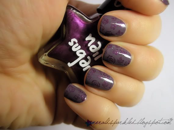
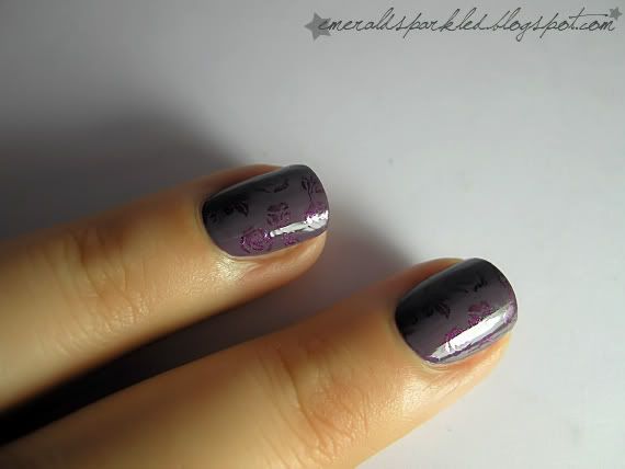
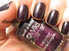
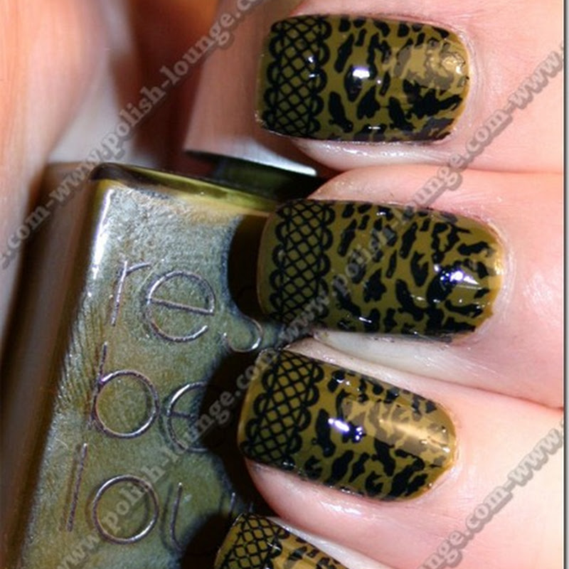
I was konading over my last manicure, using She #503. It's a purple shimmer, but not too opaque. Not too great for konad, but I used it anyway, with roses from m65.
I thought I could use She #503 to create the shimmer of Paradoxal. But when I poured some in the purple grey I mixed, the colour was changed & the shimmer was lost. I fought to bring the color back. Then I thought about adding some pigment eye shadow. The only one with the appropriate color was Inglot AMC #73, so I added about a teaspoon of that.
It's a bit bumpy, and I hate the texture, I had to use much more than the polish could hold, but I think I'm on the right way to Paradoxal. Observe:
Please excuse the bad pictures. It was so hard to photograph the shimmer in my lightbox, and I took these pictures under my tablelamp. Besides, my Coolpix is nowhere near as Dad's Pentax, which is now away.
Do you see the purple flash in the bottle?
I know this franken can be something, but I don't have the material to make a good dupe. Maybe if I had this pigment in polish form, I could have gone that far. But this will have to do until I get my hands on the real deal! ;)
Merhaba =) Geçen sefer gri-mor arası bir renk elde etmiştim ya, işte o günden beri Paradoxal'ın bir benzerini yaratmayı başarıp başaramayacağım kurcalıyor kafamı. Acaba içindeki mor ışıltıyı vermek için ne kullanmalıyım diye düşünüp durdum.
Geçen seferki manikürümün üzerine konad m65 diski ve She #503 ile desen yaparken, aklıma acaba Paradoxal'a kendine özgü ışıltısını bu renk ile mi versem sorusu geldi. She #503 fazla opak olmamasına rağmen, konad ile belirgin oluyor. Yaptığım karışıma biraz da #503 ekledim, başta umut verici gözükmesine rağmen bir süre sonra ışıltı arada kayboldu ve renk de açılmaya başladı. Bir de rengi geri getirmek için uğraştım. Sonra aklıma, pigment far eklemek geldi. Pigment far ışıltıyı verirken rengin açılmasına sebep olmayacaktı çünkü. Ben de sahip olduğum iki mor pigmentten biri olan Inglot AMC #7'den bir çay kaşığı kadar ekledim.
Bir kere yüzeyi çok kötü oldu, çünkü ojeye alabileceğinden daha fazla pigment eklemek zorunda kaldım. Kuruduğunda üzerinde küçük pürüzler oluşuyor. Ama Paradoxal'ın ışıltısına da çok yaklaştım. Resimlerde görebilirsiniz. Resim kalitesi gerçekten kötü, çünkü babamın kamerası şu an uzaklarda ve ışık kutusunun içinde sedefler belli olmuyordu, ben de biraz daha karanlık bir ortamda çektim resimleri.
Sonuç olarak elimde mükemmel bir Paradoxal yaratabilecek kadar malzeme yok. Belki bu tarz bir pigment elimde oje olarak bulunsaydı, içine dökmemle beraber ışıltı belirgin olsaydı ama pürüzler oluşmasaydı, daha iyi bir sonuç elde ederdim. Ama aslına kavuşana kadar bununla idare edeceğim artık. ;)
")
 Site URL
 E-Mail


.JPG)


.JPG)


güllü olanı çok beğendim =)
ReplyDeleteben de bugün yanardönerli lila, mor, sedefli koyu mor, taupe falan karıştırıp nası bişi oldu diye baktim, ı ıh olmadı henuz. cok kucuk miktarlarda karistirdim ztn deneme amaclıydı =) ben de ne yapsam diye dusunuyorum simdilik. oje karistirmak istiyo canım çok. hehe
@Nemo Latte ya böyle kafana göre karıştırınca genelde olmuyor, o yüzden ben beğendiğim ojeleri taklit etmeye çalışıyorum. o zaman "oldu" diyebiliyor insan, başka türlü ne elde etmek istediğini bilmeyince olmamış gibi geliyor =)
ReplyDeletethis is beautiful!
ReplyDeleteI tried doing this a couple of weeks ago. I was using the taupe Rimmel polish (Steel Grey, maybe?) and some purple pigments I have - MAC Violet pigment, and some really old pigment stacks from Charlotte Russe. I was only messing around with tiny bits on some paper, but they all turned out fairly well. The violet pigment turned out a bit more purple than I'd have liked, but the Charlotte Russe pigments were pretty good (the pigment I have from there is more of a translucent purple, rather than a straight-out purple pigment). I've got a few more lying around that I want to try mixing into it sometime, but I got impatient.
ReplyDeleteWhether yours is a dupe or not, it's very pretty :D
wow. that's a gorgeous franken!!!
ReplyDeletebence yinede çok güzel olmuş :) Işıltısı da olmayı versin birazcık :D
ReplyDelete1. Konad çok güzel olmuş, gördüklerimin arasında en iyilerinden biri hatta.
ReplyDelete2. Bence elde ettiğin renk de Paradoxal'dan çok daha başarılı! İnan bana onlar bu rengi elde edebilmiş olsalardı bunu sürerlerdi piyasaya. :) Gerçekten.
wow! the color is great on you.. perfect!
ReplyDeleteThat looks so beautiful!And I love the konadicure!
ReplyDeleteso beautiful!
ReplyDeleteI love the color!
Looks beautiful indeed. And so flawless...
ReplyDeleteI really like the first mani, and the second is gorgeous as well! You made a great franken there!
ReplyDeleteBence Flormar 319 bu franken için aradığın oje olabilir. Gümüş simli bi' füme rengi kendisi. :)
ReplyDeleteIt's sooooo gorgeous. So much more gorgeous than Paradoxal itself. You know, I've swatched Paradoxal on one nail the other day and I found it so... ugly. :-s The base is more brownish than purplish and the shimmer can only be seen in high light. Otherwise it's a dirty brownish/purplish/undecided color when it's against my skin. I'll have to swatch it and show it but I swear your take on is totally more gorgeous.
ReplyDeleteIt looks great! I love it. :)
ReplyDeleteFirst of all, thank you everyone for your comments =)
ReplyDeleteHerkese tesekkur ederim oncelikle =)
@Shanna do you have a picture of your franken? I'd love to see it!
@ℓidya ben de bosverdim zaten isiltiyi... =D
@Lydia cok sagol canim valla rengi ben de begendim ama yine de kurbaga derisi gibi bir yuzeye sahip olmasi beni delirtti =) gidicem bayilicam parayi sonunda o olucak =)))
@FrenkÜzümü, Flormar 319 raki beyazi french rengi degil mi? bir de gumus simler uygun olabilir ama ne yazik ki renk olarak tutmuyor, pembemsi mor olmasi lazim icindeki isiltinin... =/
@Nathalie, I wish the consistency of mine was a bit better. It was still wet on the pics, but when it dries, it's so bumpy, I hate it! I wish I never added the shimmer =)
I guess I will have to get paradoxal, or at least models own purple grey or essie merino cool. =/
Your franken looks so marvellous. LOVE IT! <3
ReplyDeleteThank you so much, @Daria =D
ReplyDeleteThis looks absolutely gorgeous!
ReplyDeleteAmazingly beautiful!!! I want that polish!!! :D
ReplyDeleteThanks, @Kat and @rmcandlelight! =)))
ReplyDeleteThat's amazing! Probably the closest to Paradoxal I've seen yet!
ReplyDeleteThank you, @Leah! Is it really that close? I hope I can compare them side-by-side someday...
ReplyDelete@Trincess 319 mu yazmışım, 391 yahu. :)
ReplyDelete@FrenkÜzümü bakayim ona bir =D
ReplyDeleteIt is magnificent, I like varnishs and stamping
ReplyDeleteMerci, @Stopdidine =D
ReplyDeletei think this konad is gorgeous. I love love love subtle konads.
ReplyDelete@shortwidenails, thank you =) Sometimes I prefer subtle, too =)
ReplyDeleteYour color is FAR superior to Chanel's Para-whatever. I'm being totally honest with you. I'd much rather spend 20-something dollars on this color than borrriiiiiing Paradoxal :)
ReplyDelete